Blog
December 24, 2019
The era of consumption and massive production is knocking at your door if not already in your house. The physical sphere (clothes, electronics, food, etc.) got already affected as well as the digital world. People more often find themselves in a fast-moving flow of information circulating all across our devices. This overload undoubtedly has an impact on the website and mobile application creation as well as on user interface design development. In a fight between companies to keep user’s attention, they put as much information as they can. However, it’s a wrong decision. Minimalist design is the best solution.

Why “Minimalist” User Interface Design?
In our article “How to Create a Timeless User Interface Design” we’ve mentioned minimalism as one of the most recognized trends in 2019. However, it’s not only a trendy thing for your website or mobile application but also a way to be always up-to-date with your user interface design. The minimalist design never gets old-fashioned.
Minimalist design is dealing with application’s layouts, compositions of interface elements, color palettes, visual hierarchies, and contrasts. It doesn’t require a lot of space, but – fewer elements within it. It shouldn’t be primitive, but simple and clear. Here are the following features of minimalist design:
- spare space;
- strong visual hierarchy;
- bold typography;
- limited color palette;
- emphasis on elements’ proportions and composition;
- no useless and meaningless elements.
In this article, we will gather 5 best minimalist web applications user interface design examples that follow the mentioned principles above.
Example #1
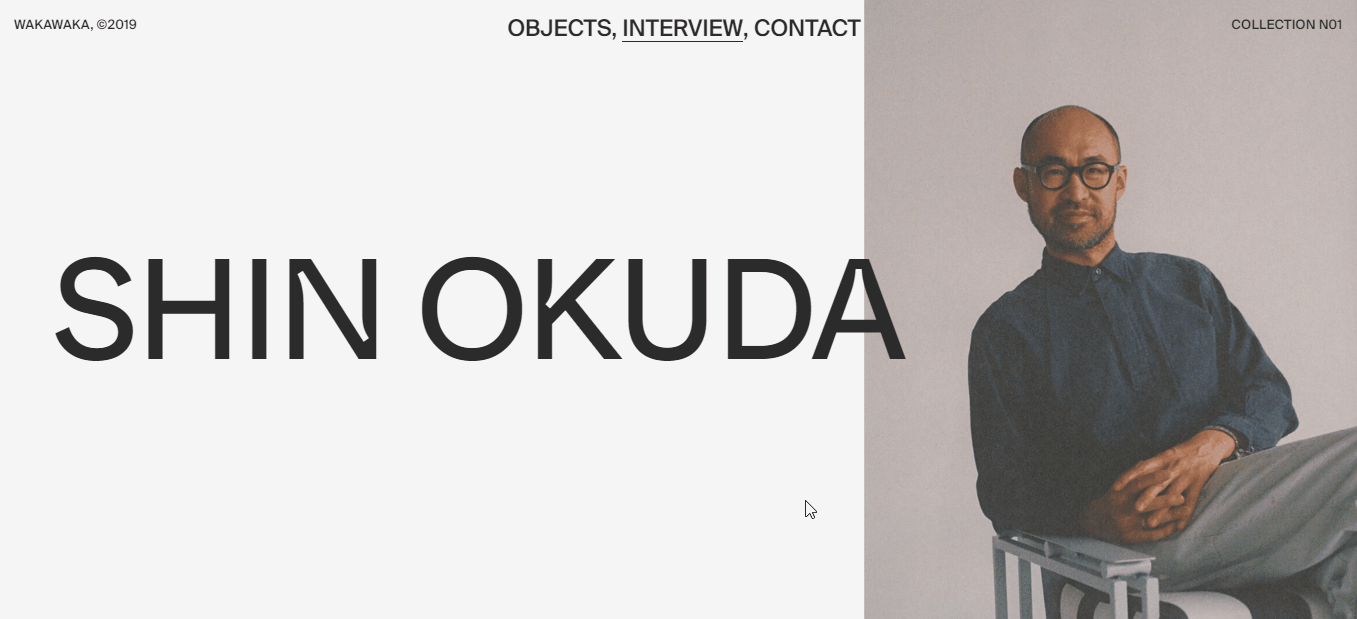
This is one of user interface design examples here. It’s an interview with Shin Okuda, a designer. The whole concept of building the website refers to a minimalist user interface design. Let’s figure out why.
The first thing striking your eyes is dominating white and black colors. The bold text is black while space around is white. Additionally, visual elements such as pictures adhere to the same “black-and-white” visual concept, but the first representative portrait with the character is more colorful. It creates a visible contrast and strong highlighting effect.
A limited color palette in minimalism is an effective tool to strengthen the power of colors. It makes users get used to the theme easier and focus on given information rather than wandering around purposelessly. With such an approach, it’s more convenient to make users focus on certain actions as buying, subscribing, donating, ordering and so on.
Example #2
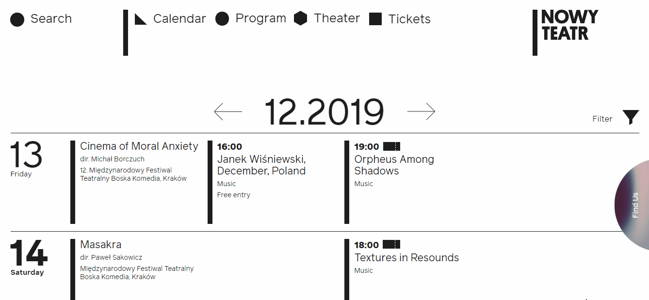
This example might remind you of the first one, but the focus moved from the limited color palette (which, obviously, is here) to a strong visual hierarchy of interface elements.
Worth noticing, a visual hierarchy is one of the primary principles of user interface design. There are certain instruments help to reach it. Look at the bold captions which are emphasizing the weekend’s working days. A table is a perfect solution to organize elements in groups; creating a space between them prompt users which element is referring to a particular category or whether it exists as an independent one.
In short, visual hierarchy is a key feature in any minimalist design since it helps to reach readability and legibility of any digital application.
Example #3
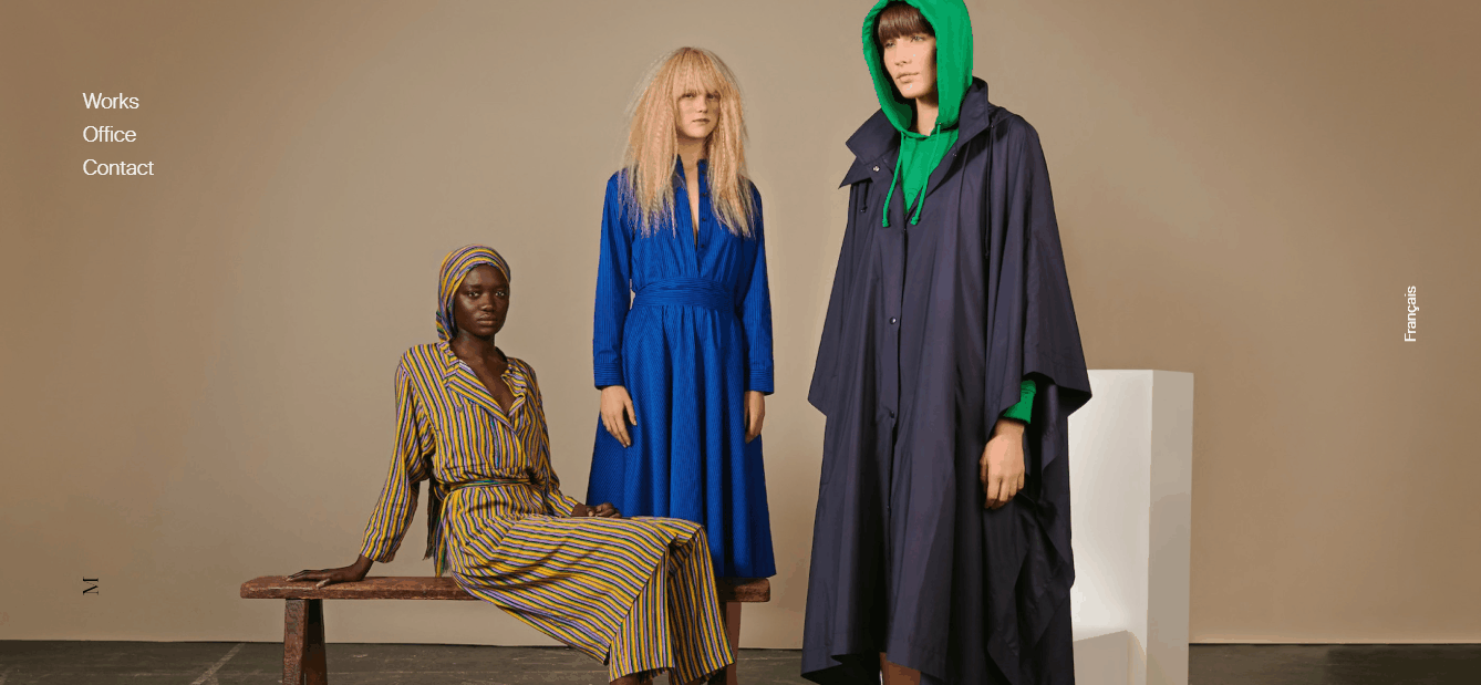
It can be considered as a vivid example of forming a right composition and reasonably using a negative space (also known as white space, however, it’s not about the color, but a space between elements).
Here you can observe an alternation of texts and pictures/screenshots. Both of them have own negative space. Color accent and black background emphasize it. Such composition is pretty easy to follow, which means it minimizes a users’ cognitive load. Moreover, all included elements have a central alignment.
In minimalist design, negative space is one of the instruments to add elegance to a user interface design and due to its one-color background, it offers a great chance to create a purposeful contrast.
Example #4
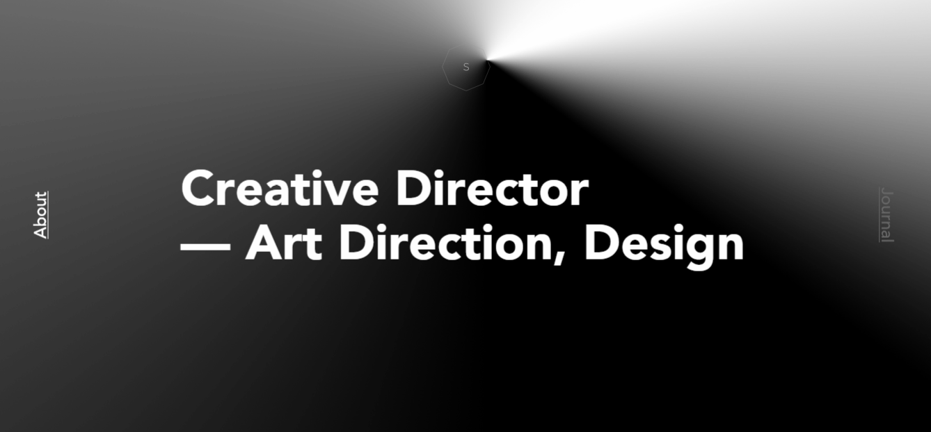
Previous minimalist user interface design examples mostly show a white negative space, but this one is different. Except for black spare space, it includes bold typography and doesn’t include any meaningless elements.
If you take a look at Awwwards nominees, you can see that “designer’s portfolio” websites usually have more or less the same interface design. They are very simple and clear since their main purpose is to sell a developer or a designer. The text is bold with large captions. Contrast is visible as well. The structure of elements is done in such a way, so users visually can get the information they want without seeking it for a long time. But what is more important here is that this minimalist website doesn’t contain any useless features that distract, spoil the impression, create a cognitive load or confuse users.
Example #5
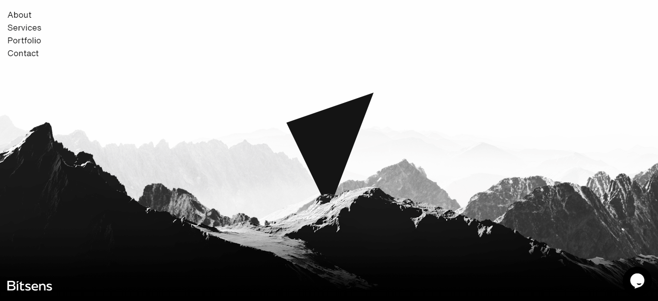
At Bitsens we greatly support minimalist user interface design, since it responds to all users’ demands and expectations and is also very convenient to use. That’s why we’ve updated our corporate website and couldn’t help to share its minimalist effect with you.
We create a “rock” interface with an emphasis on dark themes. It’s intertwined with white color to create a visible contrast and pay great attention to negative space. We preferred to use it as smart as possible marking our main services and presenting our portfolio works. Bold typography doesn’t present in our interface design since we’ve focused on captions sizes creating a strong visual hierarchy.
In the end, we got a minimalist user interface design which is almost characterized by all features mentioned in the beginning.
What’s else?
Essential to remember for every user interface designer or those who are about to order a minimalist design: sometimes it’s impossible to apply every mentioned feature. Minimalism is just a helpful carcass for your application, but to make it more individual focus on a unique visual concept.
Bitsens has extensive expertise in creating minimalist user interface designs, so to get more inspiration, visit our portfolio page or contact us to simply discuss your project design ideas.