December 3, 2019
Let me make it clear: design creation is a complex process that requires, first, thinking and, second, drawing. Changing priorities brings meaningless work to the force. That’s why in this article we’re going to focus on how to make a reasonable and creative user interface design. However, to explain it, let’s dive deeper into understanding user interface design process, elements and key working principles.

What is User Interface Design?
Instead of offering you a barely practical definition of what is a UI design, at Bitsens we’ve come up with the one that shortly highlights each aspect of it:
“User interface design is an interface for mobile or computer devices with an emphasis on colors, typographic and composition of elements that maximize a comfortable usage of an application”.
5 Steps to Make UI Design Done
We can distinguish the 2 main stages in user interface design process: user experience (UX) and user interface (UI). The first one stands for the logic of the user’s behavior on any digital application, while the second one is responsible for typographic, colors and elements composition. To create a user interface design it’s necessary to take 5 steps:
- Briefing. It comes with a short briefing session with a client or a product owner. The main goal is to define the client’s requirements and expectations as well as to get the necessary information regarding the project.
- Analytics. A step that requires information investigation. Specialists turn to a market and product research to fulfill some appeared gaps: target audience, competitors, relevant practices in the field are explored. Then, based on the gathered data, designers generate ideas.
- Wireframing. All ideas are tested on practice in the next few stages. UX designers start working on a website or mobile application’s carcass by creating wireframes with a preliminary layout.
- UX prototype. To see how the application will work and react to the user’s request, it’s essential to build a UX prototype. It encompasses all screens and interface elements. Moreover, the best way to feel a future mobile or web application is to create a clickable prototype as we do at Bitsens.
- UI creation. Getting a UX prototype is a starting point for UI designers. Keeping in mind earlier investigation results, specialists are working with color palette, shapes and contrasts to ease the users’ interaction with an app and make them enjoy this experience. The whole process is also closely connected to graphical user interface creation. It represents a system of such graphical elements as icons, buttons, type fields, visual indicators that accompany users in their communication with an application.
NB: finished UI work doesn’t mean that the whole application is ready to be launched. After the user interface design process ends, front-end and back-end developers start to work in order to transfer design in digital format through programming codes.
What are the Necessary Elements of UI Design?
“Users are like children. You have to take their hand and lead them through your application”
Bitsens’s UX Design Lead.
There are 4 kinds of elements that requires UI designer consideration in user interface design process. They are input controls, navigational components, informational components and containers. The right accent put on them guarantees that a user won’t get lost within an application.
Input controls
It includes interactive elements that allow digital communication to start between users and applications. For example, checkboxes, radio buttons, dropdown lists, list boxes, buttons, toggles, text fields and date fields – all of them amplify the established interaction and user interface design shouldn’t allow it to fail.
Navigational components
Elements of this category are search fields, bread crumbs, paginations, tags, sliders, icons, image carousels. They represent signs for users to move in a certain direction through an application and to feel more comfortable in using it.
Informational components
As it’s seen from the name, these components are responsible for informing users about any changes that happen during the application usage: notifications, progress bars, tooltips, message boxes and pop-ups.
Container
The last category contains one interface element – accordion. It’s a list that includes text or picture inside it if you click on it.
4 Golden Rules of User Interface Design
User is a center of both UX and UI design and we can apply the most common principle – “users above all”. However, there are 4 practical user interface design principles that work as well.
Visibility
“Make things you want your user to notice bright and saturated”
If your intention within the application is to sell a product, then surely make a “buy” button visible for your clients. This user interface design principle also works vice versa: if you want to hide anything from your user, but can remove it from the application, just make it less visible with an emphasis on light and neutral colors.
Centrality
“There is only one main object on the screen”
You can’t have 6 CTA buttons on a screen. Remember, users’ attention is precious. In other words, make them enjoy the interaction with your product. Don’t distract with elements that shouldn’t be on the screen. Moreover, think about a reasonable placement of all elements and priority among them to highlight the order in user interface design process.
Minimal cognitive load
“Don’t confuse your user and don’t force him\her to learn your application anew”
Cognitive load can be defined as an amount of effort users put to understand your application as well as the connection between elements within it. Long-lasting cognitive load shows something is wrong with your application. It means that a composition of elements, colors, typographic confuse users and even their previous experience with third-party applications can’t help. Don’t try to reinvent the wheel.
Integrity
“Things that are placed together, perceived by a user as a whole”
This principle can easily play tricks with you and your users. On the one hand, it can be beneficial, if your idea is to show the interdependence between 2 elements. On the other hand, if you create a table where all criteria should be equally highlighted, but there are no spaces or indents between them, then it may get users confused.
Main Traits of Web and Mobile User Interface Design
Even though UI design is based on certain fundamental principles, some of them differ when it comes to mobile or web applications.
Mobile UI design
Users patterns of behavior
Mobile users and web users are 2 different types of users because their behavior is influenced by rules of different applications. First ones has 2 more kinds: iOS and Android mobile users. People with certain operating systems get used to their workflows and might become too overloaded with unfamiliar layout elements or colors.
Theme
The user interface design of any application, including a mobile one, should respond to its concept. If you’re aiming to launch a relaxing application, avoid using too bright and saturated colors.
Tapable Interactions
The majority of mobile devices have touchscreens, while a desktop user can take any actions with a mouse or a touchpad. This difference plays a huge role in creating UI design. You can have 4 different ways to exit from a web page, but they can’t be applied to mobile devices. That’s why you need to come up with options that work well with a touchscreen.
Web UI design
Responsiveness
It’s one of the most important features that guarantees a satisfying experience for your clients. Whether your users want to look at the website on tablets, computers and mobile devices, your application should be able to respond to these changes.
Clickable Interaction
As was mentioned above, the desktop version of the web application has another approach to its usage. The task for user interface design here is to take these features into account and create a relevant design for clickable devices.
Composition
The composition of elements in web application differs from a mobile one. While mobile users get used to a portrait, web users – to a landscape. UI web designer should adjust his/her work to the common rules of the web application composition, like creating a horizontal navigation system instead of vertical one.
Good vs. Bad User Interface Design
We’ve gathered the most common UI mistakes here or in general some things that make your interface design look worse. In opposition we are going to present correct variants. We will focus on 3 widespread features of UI design, that are highly appreciated if they’re done in a right way.
- Consistency
The term refers to an absence of visual harmony that should be implemented in a good application. An inconsistent website or application usually has different fonts, bad-suited colors, meaningless graphics and different information structures on each page. Don’t let your elements stand out in a wrong way, but create a perfect blending.
Bad Example
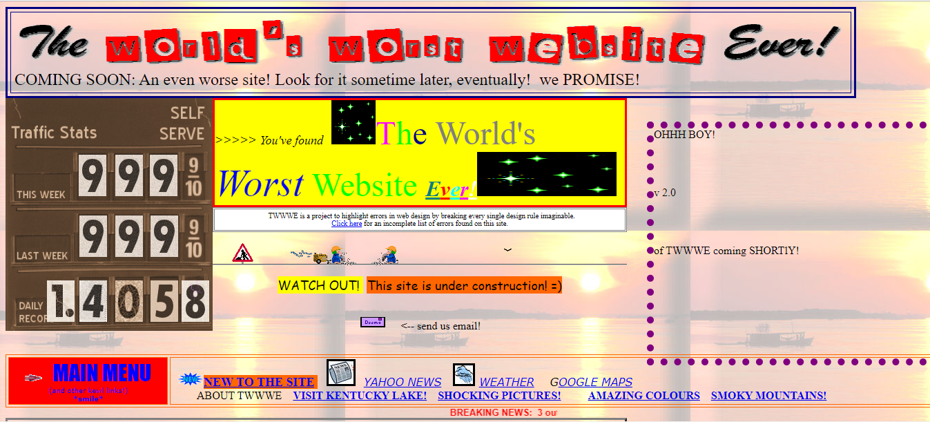
Good Example
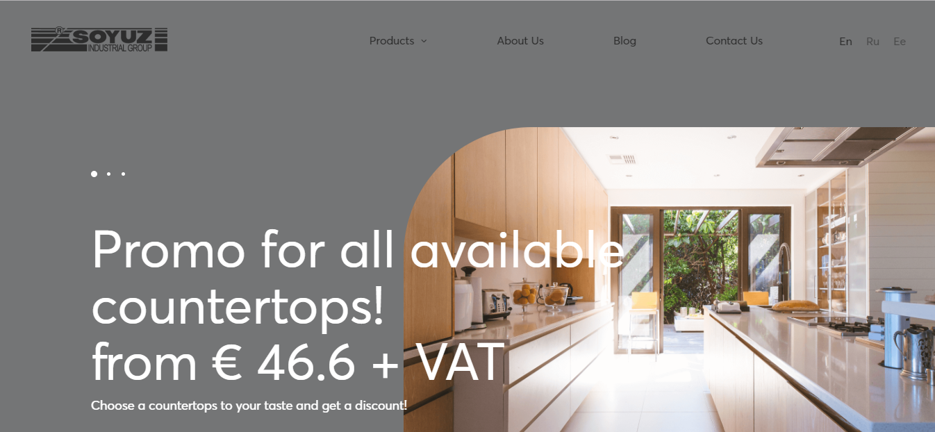
2. Responsiveness
Responsive design is a way to conquer users’ hearts. When your website can be adapted to different device sizes and resolutions, it creates a satisfying experience for your visitors. Otherwise, it brings a lot of wasted scrolls and movements.
Bad Example & Good Example
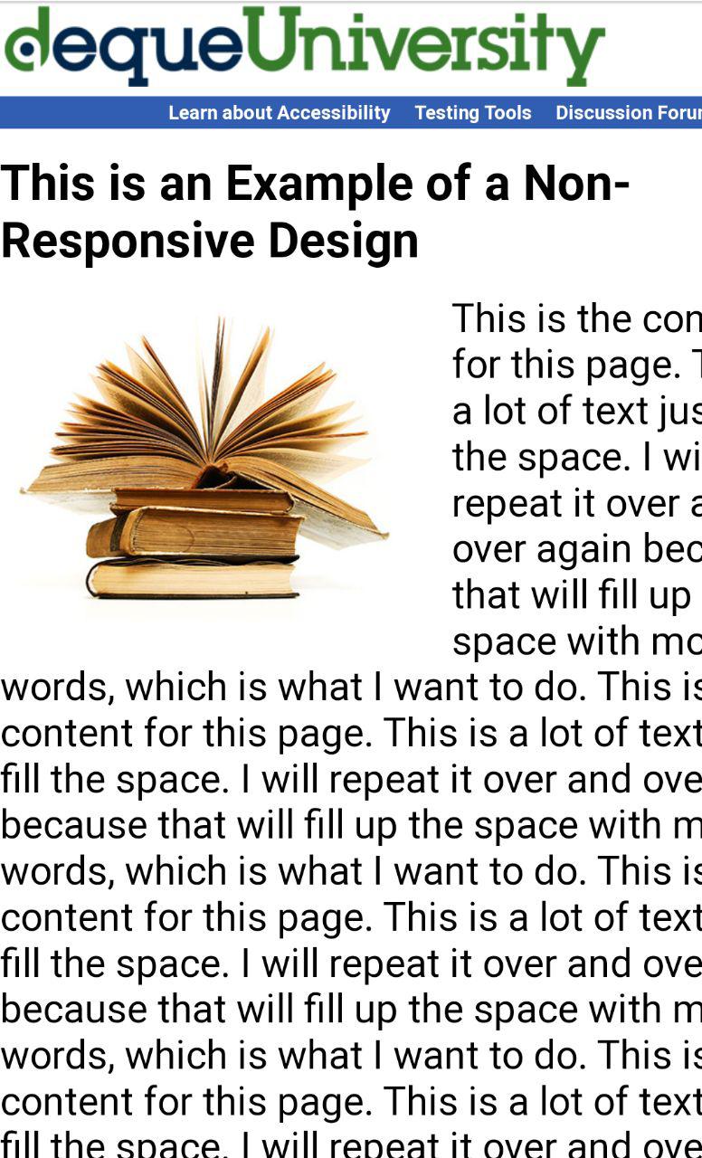
-

Pic. 4. Responsive UI design. From Dzukijos Tvenkiniai.
3. Lack of Contrast
Good contrast on a website or mobile app allows users to perceive information better. When the right elements are highlighted and colors are different, the structure of an application becomes visible and clear. Don’t try to create a colorful screen, but focus on finding the right and smooth balance.
Bad Example
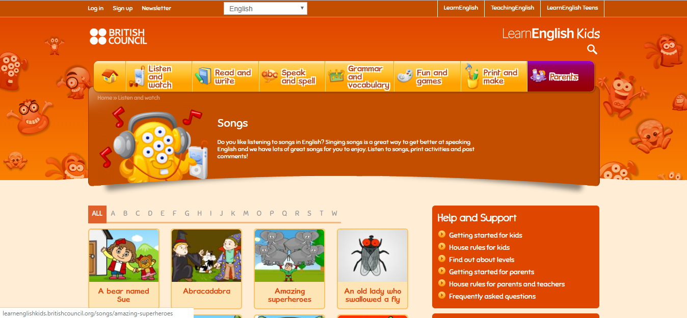
Good Example

Current Trends in User Interface Design that Everyone Should Know
Here we’ve tried to list the most recognized and effective trends of 2019 in UI design, that we believe will also stay for a long time.
Minimalism
We can equate this trend to simplicity in an application, but it also stands for impressive monochrome design, bold captions, lack of elements on the screen and free space. Minimalist user interface design in applications seems to reflect the opposite side of the world where everyone is busy and overloaded with information.
Hand-drawn Illustrations
People highly respect one’s creativity and originality these days. Simple hand-drawn illustrations can conquer users easily with the efforts and time that a designer puts to make it. It feels more personal and seems to be created especially for an individual.
Large and Bold Typography
Captions made in such style become main elements on a screen and visible to users. Take this creative tip into account, if you want to highlight titles within your user interface design.
Dark Theme
This trend is dictated by the Apple dark theme release. Even if now it isn’t so obvious, but dark theme appears in web and mobile applications step-by-step. Dark colors and shades create a capturing and mysterious atmosphere attractive to users.
Final words
Now you can imagine what a huge and complex system lies behind a user interface design. It’s not only about drawing and making everything beautiful. It’s about creating a reasonable beauty.
This article shortly represents Bitsens’s knowledge and expertise in working with interface design. As a team, we always strive to find the best solutions in UI and UX design. All of the mistakes that were described we undoubtedly avoid; all listed trends we apply in our works. At Bitsens we offer you the best UI design practices in creating web and mobile applications. Visit our website to get acquainted with our projects!