January 3, 2020
As time goes by, some things become outdated and are no longer able to fit the modern standards of the word. This also applies to a digital world that is changing every minute. For example, new technologies, approaches, trends, and tools appear to help designers and developers improve their works and ease the creation process. That’s why some digital products, such as web or mobile applications, can easily “get old” one day as well as their user interface design. The best solution is to make a website’s/mobile app redesign or create a new one, as a last resort.
In this article, we’ve gathered the “outdated” – bad user interface design – examples and “improved” – good user interface – examples. So, we aim to define the problems of old designs and implemented solutions which made the final versions look better. We will see how the creative transformation in user interface design works.
How we will judge?
Before going straight to the chosen examples, it’s necessary to highlight using criteria. So, we will base the analysis on the most essential principles of good user interface design we discussed in “How to Create a Timeless User Interface Design” and “5 Primary User Interface Design Principles” articles. They are:
- strong visual hierarchy,
- simplicity,
- intuitiveness or minimal cognitive load,
- feedback reactions,
- visibility,
- centrality,
- integrity,
- long-lasting design,
- innovative design.
Not all of them must be present within a digital application, but some primary ones should be. Moreover, if you’re intended to apply any of the mentioned principles, it’s better to follow them till the end. Let’s see on our examples, what principles were not followed and what improvements were done.
Evocean: Good & Bad User Interface Examples
Evocean is a Swiss software development company. Till the summer of 2017, it had one version of the website which experienced some changes in user interface design then and we released to the world in a new updated look.
Problems:
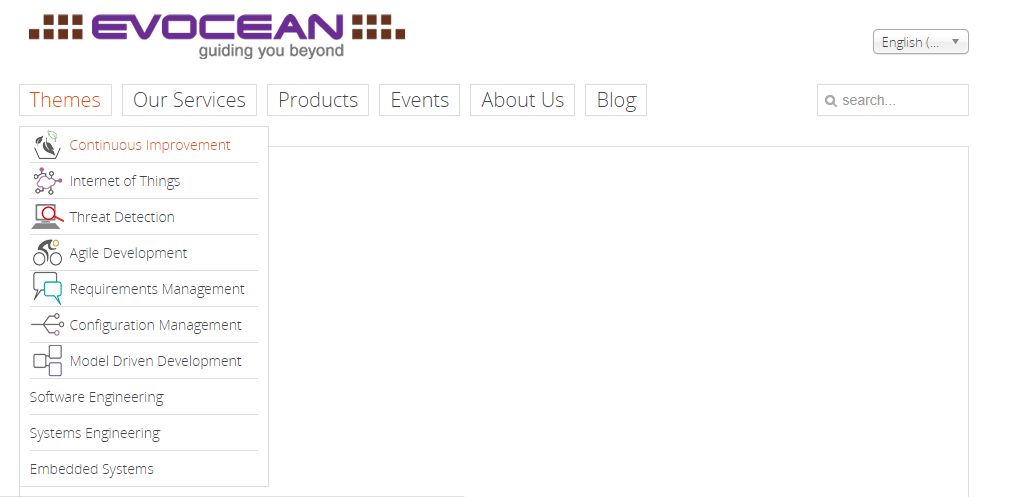
There are 2 user interface design issues Evocean’s old website had. The first one is related to contrast. Lack of contrast, to be exact. A huge negative white space strikes our eyes. Moreover, there are no or just little of other colors present. Even the text doesn’t create any contrast effect since it’s not bold and seems to dissolve in a white space.
Second, the issue is in the visual hierarchy. Actually, it’s closely related to the lack of contrast since it’s considered to be one of the tools of the visual hierarchy. For instance, you can see rough text alignment, different fonts, and sizes, with no color emphasis on headers and titles. So, all of these things complicate information perception and confuse users a lot.
Solutions:
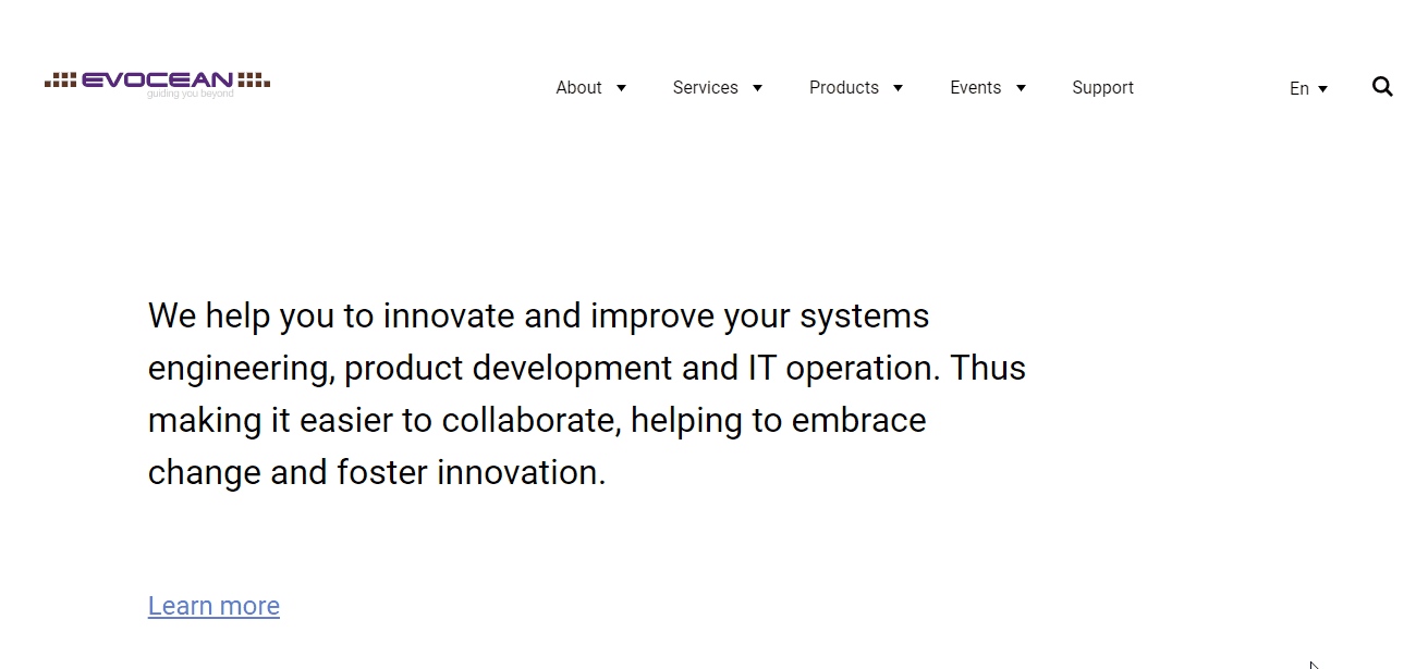
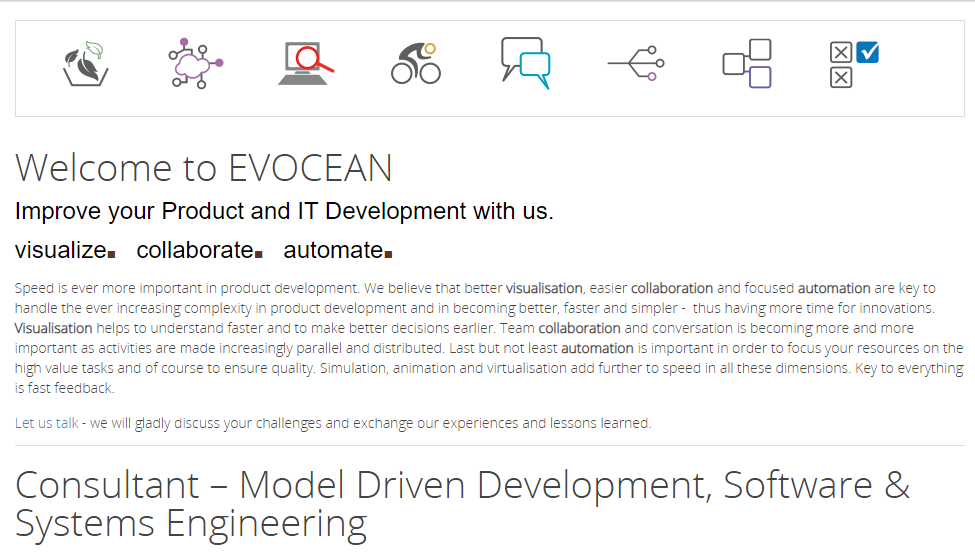
The updated version of Evocean’s website solved all the issues. Now you can see a contrast between white, purple colors and blue shades on the website. Creating rectangular text blocks, bold typography on titles, common text alignment and repetition of visual text templates help us to structure information. What is more important, the new website has applied the principle of feedback reaction by adding a hover, which means if you move the cursor to any text column, it will show what you’ve chosen by changing the background color or a title color.
In the end, Evocean received a structural and minimalist website. The advantages of good user interface design, in this case, are minimal cognitive load and satisfying experience for users.
Soyuz: Good & Bad User Interface Examples
Soyuz Industrial Group is an official furniture distributor in Russia. In 2019 they decided to update the interface design of a corporate website since the previous version seemed to be too outdated.
Problems:
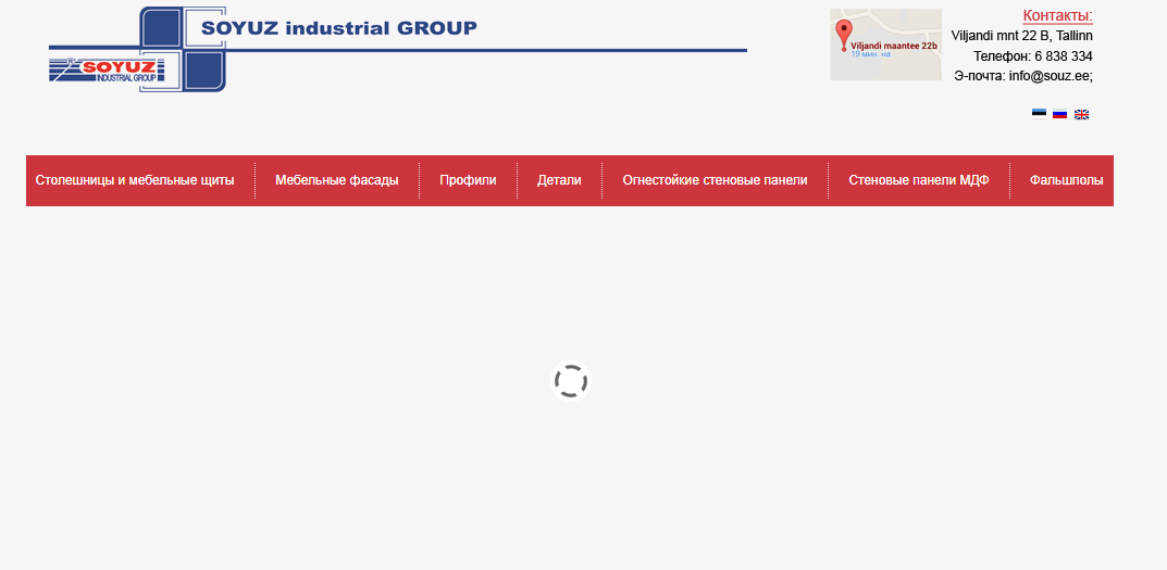
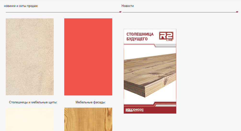
As a unique and the only one distributor of furniture according to European standards in Russia, Soyuz Group needed to have an innovative and stylish design. However, the old version didn’t respond to their needs and didn’t deliver the main message. It was overloaded with interface elements, the proximity between them didn’t allow to identify to which category they are related to and color palette was chosen unsuccessfully.
Solutions:
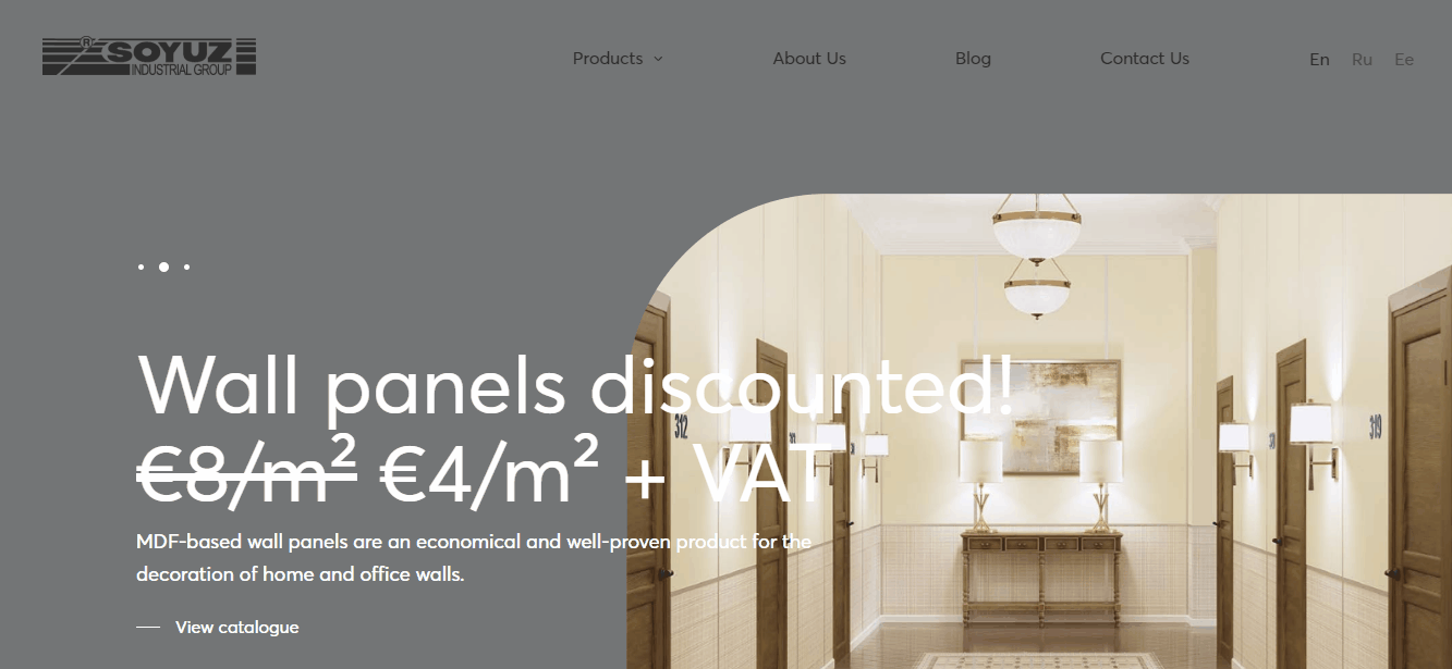
To create a new version of the corporate website, designers saved the previous structure, but add more innovative features. They’ve chosen a new pastel color palette, applied modern typography solutions, vertical placement of text blocks for light information perception, clear category division and hover effects. As a result, a new look pleases the users’ eyes and, what is essential, reflects the company’s message and status within a market.
Let’s conclude
The most important lesson that should be learned from these good and bad user interface design examples comparison is that UI principles are an integral part of creating digital applications. They not only serve as a basic creation tool but help to stay in touch with a fast-changing world simultaneously. So, add creativity, personal approach and company/product specialization – you’ll get the best user interface design. Bitsens has worked on 2 mentioned above projects by refreshing and transforming their websites and mobile applications.
After 7 years in business, we’ve faced numerous projects that required design updates for a better company’s representation, improved website performance, and convenient users’ usage. Visit our portfolio page, to get acquainted with our best works or write to us whether you have any questions or want a simple consultation on your project.